Variability and Skewness
Charting can show various types of curves.
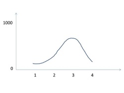
The most commonly known is the bell-shaped curve.
If we found a school like this, we could assume that most students were sort of at the middle - not depressed, but not the opposite either. The extreme cases are the minority.
Here, variability for depression is low. Meaning, most students are similar and are around the middle.
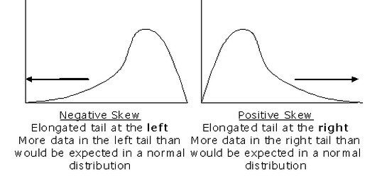
If most students are depressed, the distribution curve will look like the graph on the left.
If most students do not have depression, the distribution curve will look like the graph on the right.....i.e., most are scoring around 1 to 2.
In this school (right graph), there is low variability where most students are not depressed.
If most students do not have depression, the distribution curve will look like the graph on the right.....i.e., most are scoring around 1 to 2.
In this school (right graph), there is low variability where most students are not depressed.
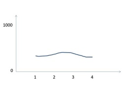
If the school has a good mix of students, i.e. a wide range from low to high depression, the distribution curve will look like something this (flatter).
In this school, there is high variability for depression.
Meaning, there are just as many who are depressed and not depressed and in between.
Where do you think the average or mean is going to be?
In this school, there is high variability for depression.
Meaning, there are just as many who are depressed and not depressed and in between.
Where do you think the average or mean is going to be?
