Skew & Kurtosis
When we plot our data that we collect onto a graph, we hope that it looks like a nice symmetrical bell-curve. But often we can get graphs that are skewed or have some kurtosis.
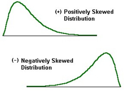
1. Skew / Skewness
If there's a skew in your data, it could pull your mean to the left or right ....away from where most of your data actually is. The first graph shows a right skew (+), and the second shows a left skew (-).
2. Kurtosis
A kurtosis is not a medical condition. Whew!
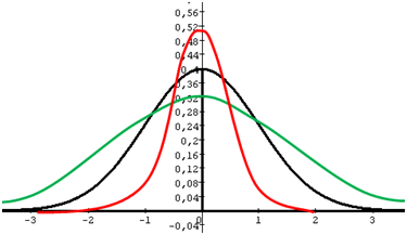
Kurtosis tells us whether our data is peaked or flat relative to a normal distribution.
If you were to compare 3 groups with similar means, you might find that the shape of your bell-curve could be different (like the image below). The one that is peaked has more people closer to the mean. The one that is flat has more people further away from the mean.
If kurtosis =
Zero (0) --> Normal distribution (Standard normal distribution)
Positive (+) --> Peaked distribution
Negative (-) --> Flat distribution
The video below provides a summary of what we've discussed thus far and adds to our understanding of kurtosis.